The kitchen is the undisputed heart of the home, but getting the vibe right can feel intimidating. In 2026, kitchen design is shifting away from stark, sterile whites and embracing spaces that feel collected, warm, and rich. The easiest way to get that high-end look without a full remodel? The perfect paint color. Here are fifteen designer-approved shades that bring instant atmosphere and timeless style.
1. Warm Mushroom and Creamy Taupe
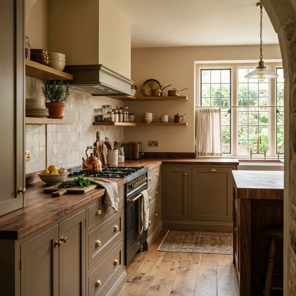
This isn’t your average beige.
A rich, earthy mushroom paint creates a grounded, European-cafe aesthetic that feels incredibly sophisticated.
It pairs beautifully with unlacquered brass hardware and warm wood tones, making the kitchen feel instantly lived-in yet entirely upscale.
2. Moody Olive and Soft Sage
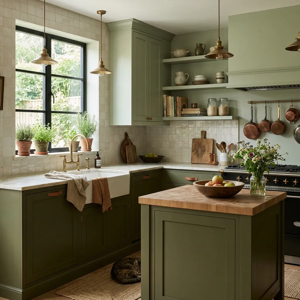
Green kitchens are officially a classic choice.
A deep, muted olive brings a sense of organic luxury to cabinetry, while a softer sage expands smaller spaces.
It functions as a neutral while adding a subtle connection to nature that feels grounding and calm.
3. Plaster White and Alabaste
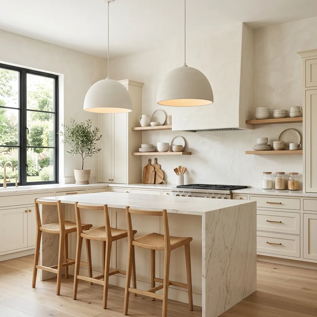
Stark, cold whites can make a kitchen feel like a lab. Instead, 2026 is all about soft, reflective whites with warm undertones that mimic vintage plaster.
This choice maximizes natural light, creating an airy, bright backdrop that still feels welcoming at night.
4. Ink Blue and Soft Charcoal
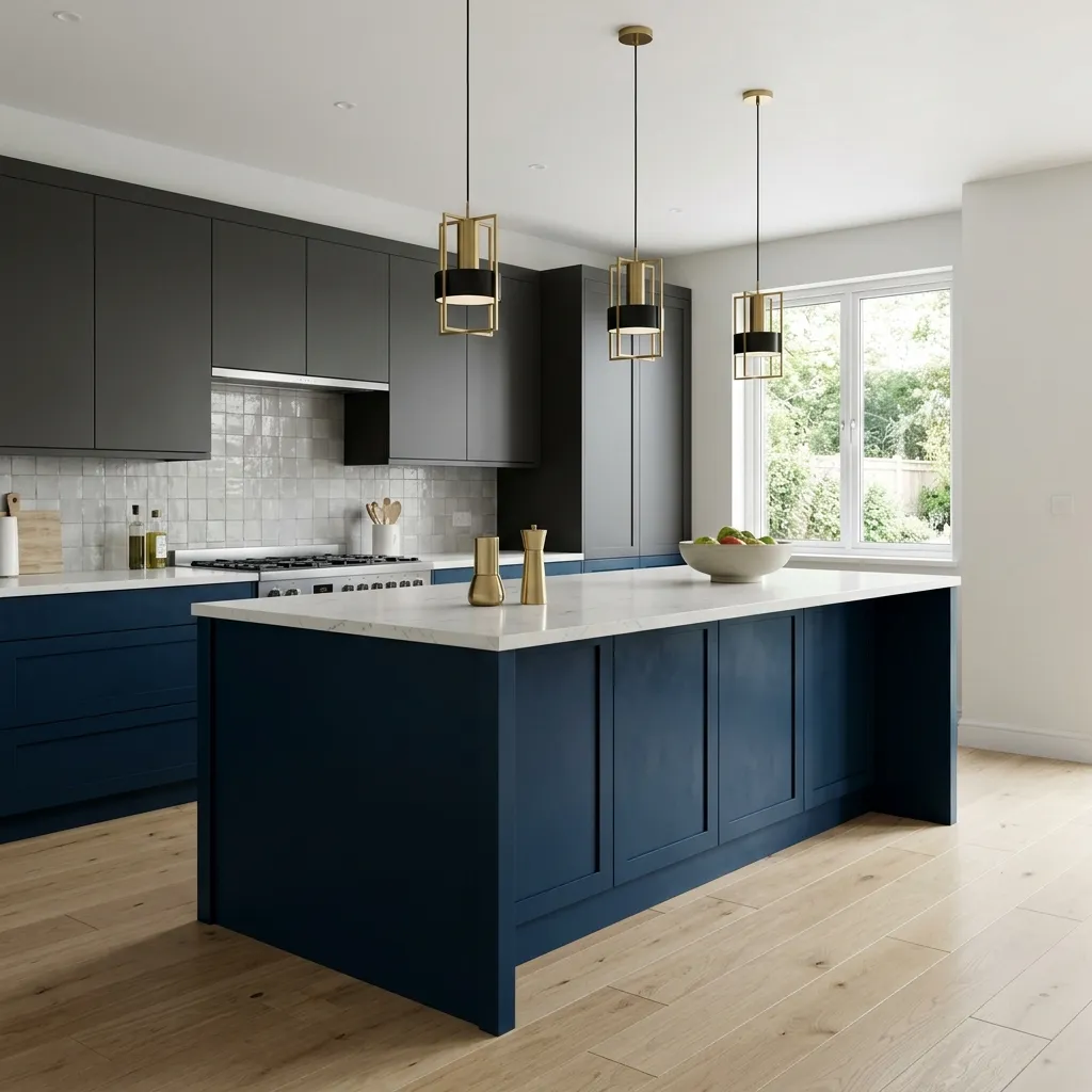
For a look that commands attention, deep ink blues and soft charcoals add dramatic depth.
Painting a kitchen island or lower cabinets in a dark, velvety hue anchors the room and makes light countertops pop.
It is the ultimate recipe for a high-contrast, modern aesthetic.
5. Rich Terracotta and Muted Clay
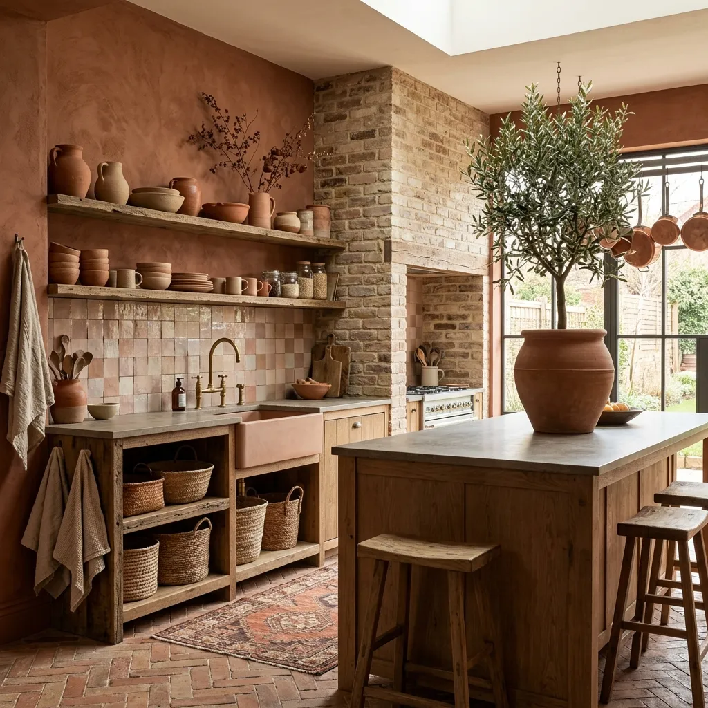
Bringing unexpected warmth into the kitchen, soft terracotta and clay tones are trending for their earthy, artisanal feel.
These colors work beautifully in spaces with plenty of texture, like exposed brick, open shelving, and tonal zellige tiles.
6. Barely-There Greige
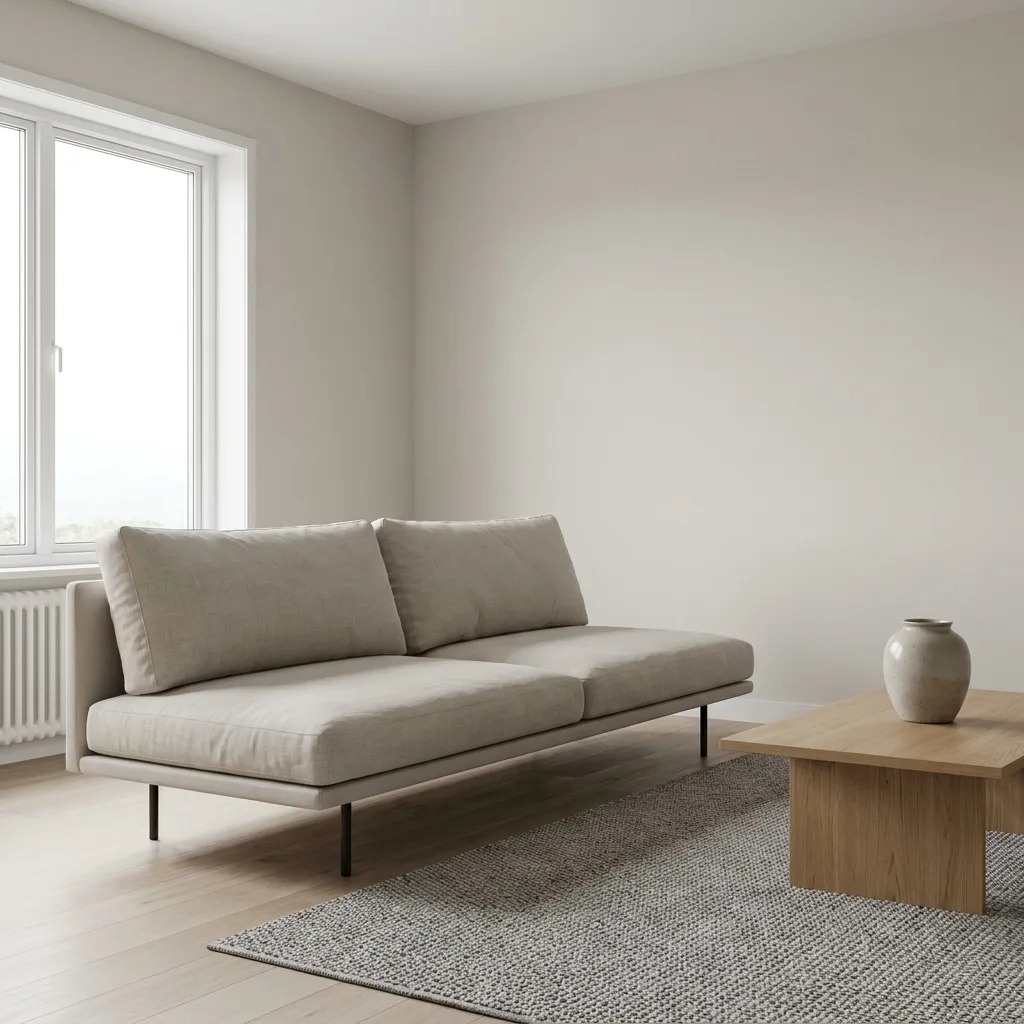
When pure gray feels too cold and beige feels too traditional, greige is the perfect middle ground.
This versatile shade shifts beautifully throughout the day as the light changes.
It offers a clean, minimalist look while maintaining a cozy, inviting undertone.
7. Dusty Blush and Warm Rose
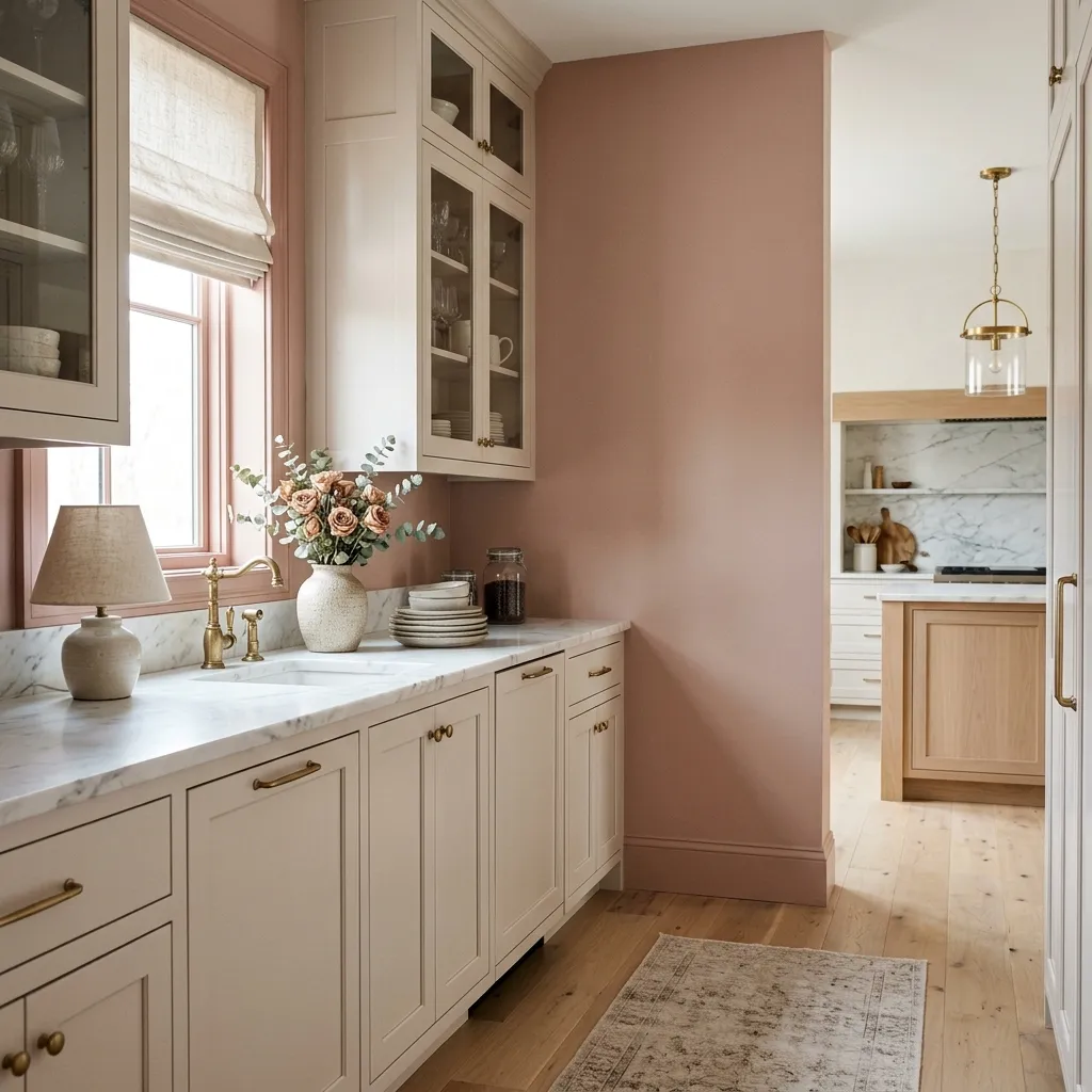
A subtle, sophisticated choice that acts as a modern neutral.
A muted, dusty rose brings an unexpected layer of warmth and elegance to kitchen walls or a butler’s pantry.
It pairs naturally with marble countertops and light oak floors for an airy, romantic vibe.
8. Espresso and Rich Chocolate Brown
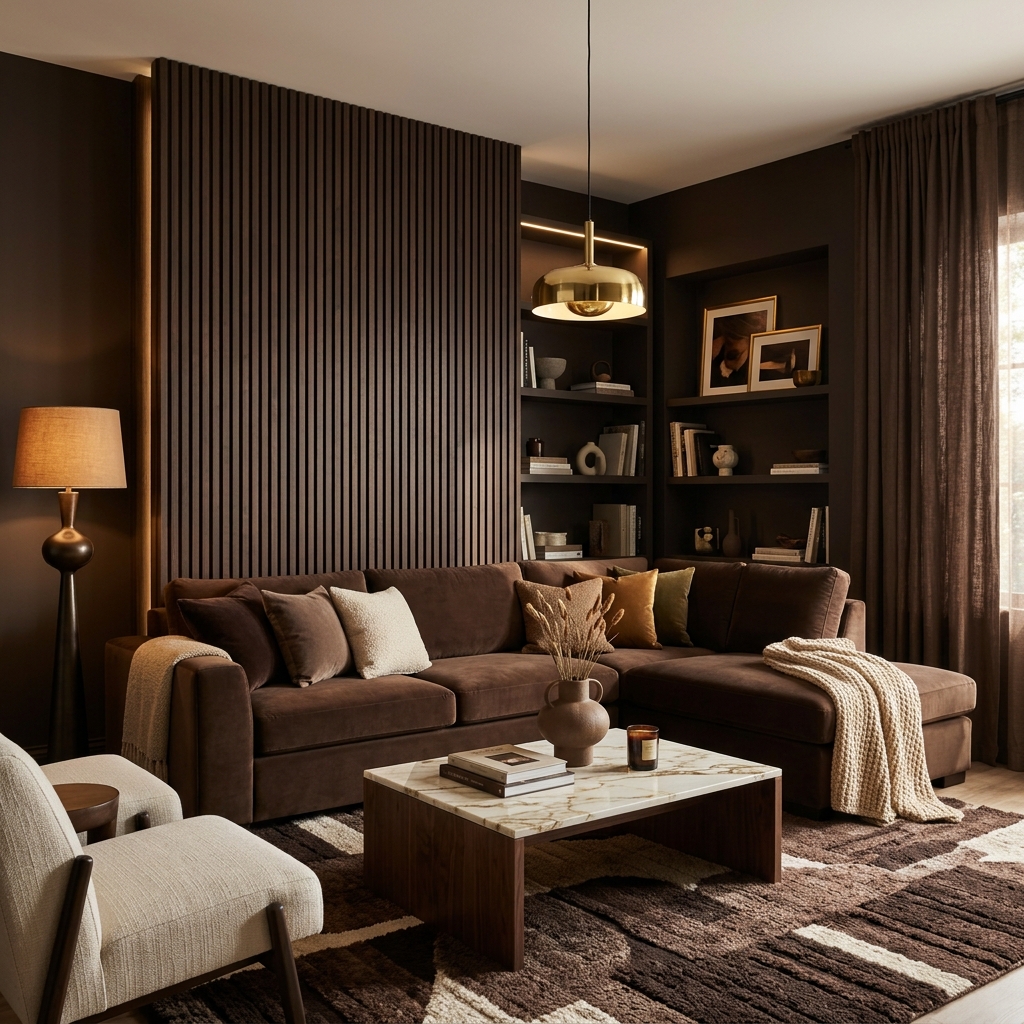
Deep, luxurious browns are making a massive comeback in modern interior design.
An espresso paint color offers a softer, more dimensional alternative to true black.
It creates a cozy, cocoon-like atmosphere that feels incredibly high-end and intentional.
9. Crisp French Gray
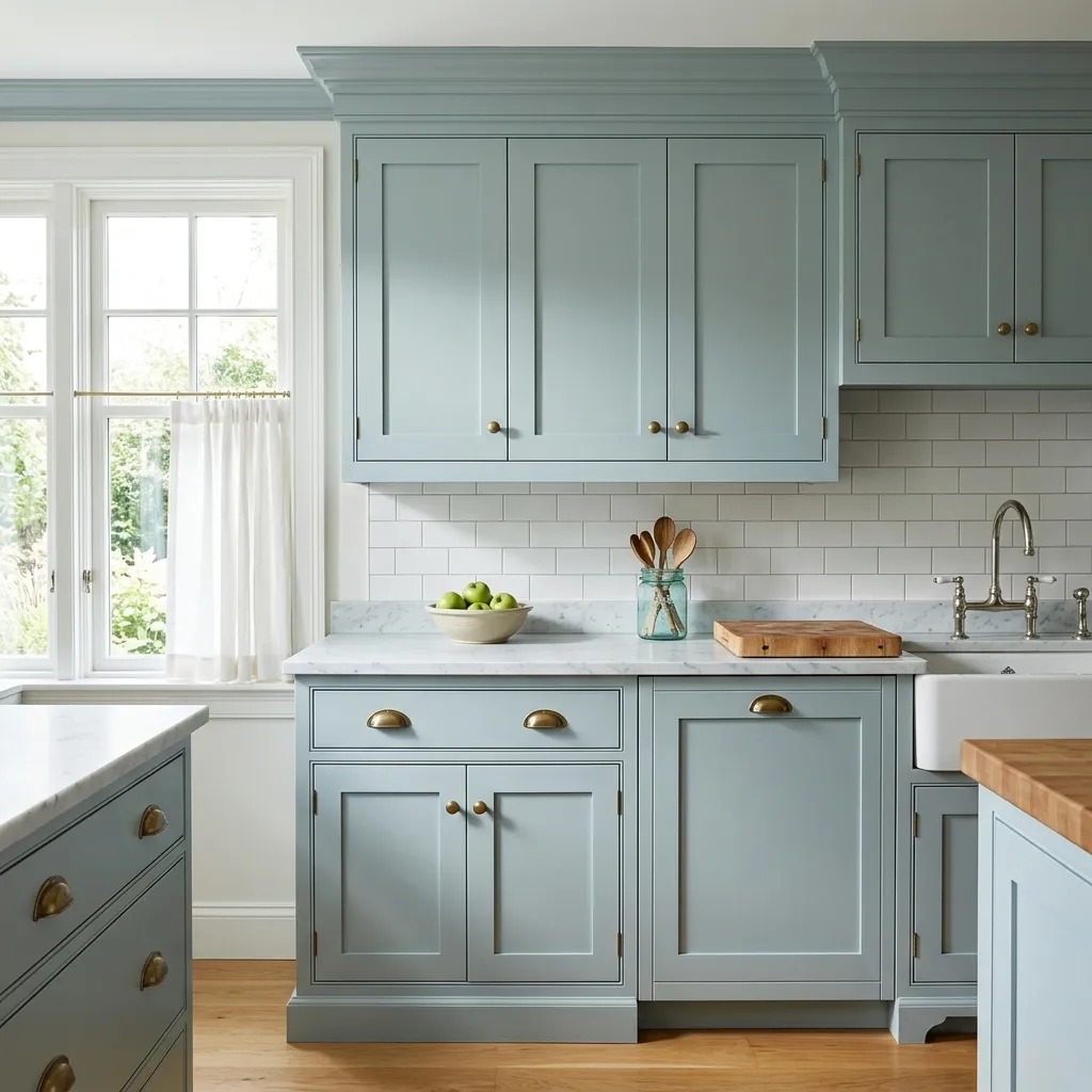
With distinct blue and green undertones, a classic French gray feels bright, fresh, and historically rooted.
It is a fantastic choice for shaker-style cabinets and spaces with traditional architectural details, offering a clean look that never goes out of style.
10. Buttery Soft Yellow
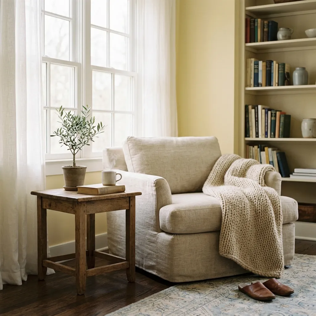
Bringing a cheerful, sun-drenched energy into the home, a muted, buttery yellow is the ultimate comfort color. The key is choosing a shade with a heavy cream base so it feels sophisticated rather than bright, creating a space that feels permanently bathed in morning light.
11. Slate Teal and Deep Aqua
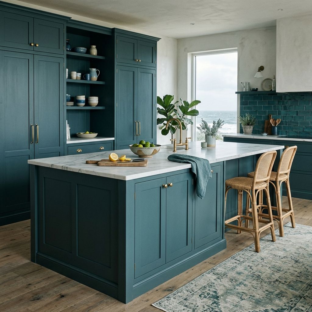
This rich blend of blue, green, and gray offers a moody, coastal-inspired elegance.
A slate teal creates a stunning focal point on a kitchen island or a wall of built-in pantries, striking the perfect balance between bold color and timeless restraint.
12. Warm Oatmeal and Biscuit
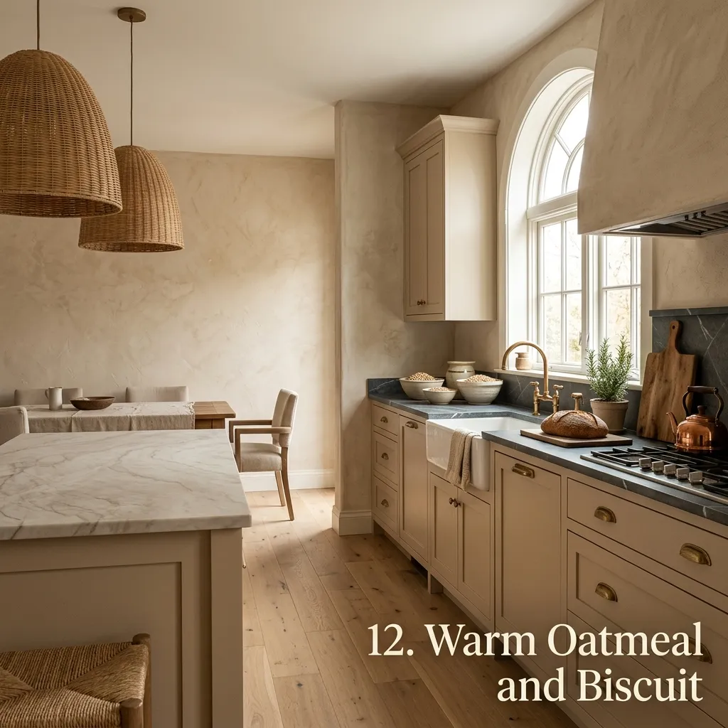
Soft, comforting, and incredibly chic, oatmeal-toned walls bring a textured, tactile feeling to the kitchen.
This color palette relies on subtlety, allowing high-quality materials like soapstone, quartzite, and woven lighting fixtures to take center stage.
13. Vintage Ochre and Mustard
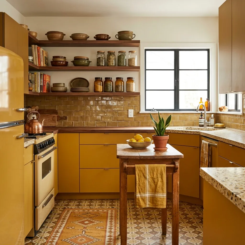
For an artistic, mid-century or old-world touch, a muddy ochre adds instant personality.
This rich hue brings an undeniable coziness to the kitchen, making large spaces feel more intimate and small spaces feel incredibly intentional and design-forward.
14. Soft Dove Gray
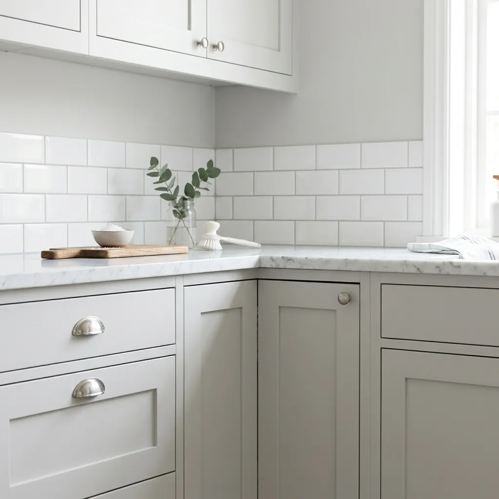
A timeless classic that always performs well, dove gray is light, airy, and entirely foolproof. It provides just enough contrast against white subway tile or marble backsplashes to make the woodwork stand out without darkening the room.
15. Velvety True Black
Bold but entirely timeless, a matte black kitchen makes a powerful design statement
. When paired with warm wood ceilings or bright marble counters, it feels modern, sleek, and structural—perfect for anyone looking to create a striking, high-contrast space.
💡 The One-Third Lighting Rule
To ensure a new kitchen paint color looks expensive rather than flat, always test the swatch in three distinct spots: next to a window, in a dark corner, and directly under the overhead artificial lights. Colors shift dramatically between natural morning light and evening LED bulbs, so checking all three prevents any unexpected undertones.
Final Thoughts
Choosing a kitchen paint color is all about deciding how a space should feel. Whether opting for the grounding depth of a moody olive, the crisp brightness of a plaster white, or the cozy luxury of a rich mushroom, the right hue transforms the kitchen into a destination. A fresh coat of paint is the easiest way to elevate the everyday experience of home.